Embrace complexity with B2B design
11 Sept 2024
Why B2B is just as fun as B2C
B2B UX design, although often overshadowed by B2C design, presents its own distinct challenges and rewards. While B2C design emphasises engaging and compelling interfaces for general consumers, B2B products focus on functionality, speed, and efficiency tailored for business users operating in high-pressure environments. B2B design requires attention to a variety of job roles, seamless integration with other systems, and the development of actionable data visualisations. Furthermore, designers must navigate the needs of end users while also considering the expectations of decision-makers who may not directly use the product. The complexity inherent in B2B design makes it a fascinating and impactful area for UX designers.
Have you ever noticed that when people talk about UX design generally, 9 times out of 10 they're referring to B2C (business-to-consumer) products, not B2B (business-to-business)?
I get why - designing for products and services that are widely available and improve the lives of the every day person is fulfilling, but I think business product design can be equally exciting and rewarding! So I want to share my perspective and highlight some important factors that make designing for B2B distinct from B2C and make it an exciting space to challenge yourself.
B2C? B2B? WTF?
First off, let’s break down the basics. The main difference between B2C and B2B products is about who’s using them. B2C products are for everyday folks like you and me - think of things like online shopping, personal banking, social media, gaming, the list goes on. B2B products, on the other hand, are designed for companies and their employees. Classic examples like Salesforce or Workday (which will be familiar to any fellow F1 fans), help businesses handle things like HR tasks, project timelines, and customer relations. But the person working on a shop till, flying a plane, or designing a clothing line are also using business tools - it's not all dashboards and spreadsheets!
Although both B2C and B2B designers want to create user-friendly, impactful experiences, the complexity and goals of the products can be quite different. Business tools are often used in crucial situations where speed, efficiency, and accuracy are super important. This means there are some big differences in how we design for each.
What makes B2B uniquely challenging? (& rewarding imo)
Functionality over flash
One of the biggest differences between consumer and business products is that usability will always take precedence over flashy designs. In consumer product design, we usually aim for fun, eye-catching experiences to grab attention in a saturated market. But in the B2B world, gratuitous functionality and playful motion design can actually get in the way.
In a work environment, people often use these tools under pressure where they need to get things done fast and without distractions. Imagine a sales associate at the till trying to quickly process a long line of customers - if the interface has too many animations or transitions, it’s gonna be a nightmare. Or imagine you're emergency phone operator and your call log software overwhelms you with additional functionality. It's the role of the designer to understand the challenge and design an interface that minimises the chance of user error as much as humanely possible - so in these cases the balance between visual appeal and simplicity and usability is key.
“The more complex the scenario, the higher the need for supportive user interfaces. Thus, B2B sites ought to emphasize usability more, not less, because they must help users accomplish more advanced tasks and research more specialized products.”
- NN Group
Designers working on B2B tools prioritise creating interfaces that are intuitive, functional, and easy to grab onto, helping employees finish their tasks as smoothly as possible. That doesn’t mean ditching all creativity in the design, just ensuring it doesn’t impede efficiency by keeping the user's environmental context and needs front and centre.
Complex archetypes
One of my favourite aspects of B2B design is number of different user archetypes you learn about and design for. In a typical B2C scenario, designers usually just focus on a handful of user groups. For example, Spotify users can be grouped into the Listener and the Creator archetypes, to access and upload audio content respectively.
But with B2B products, archetypes usually line up with a person's job role, and there is a much wider range of roles and functions within a business, each with their own specific needs and goals to think about. Take Workday, for example; it has to cater to recruiters, new employees, absent employees, managers, HR reps, project managers, and more. Each archetype will have different goals, but users can fit into multiple archetypes, so designers must navigate this complexity to define how the various user journeys interact and connect, and how they will differ.
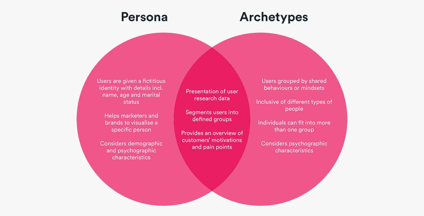
Image from Beth Strong on Builtvisible
Knowing these different archetypes and how they use the product is super important for creating a B2B tool that works well for everyone. Designers need to ensure that each type of user can easily access the features they need, catering to different skill levels while keeping overall usability in mind for the entire user base.
Designing with integrations in mind
Another key factor in B2B design is making sure everything integrates smoothly with other systems. Businesses rarely use a single tool in isolation; instead, they rely on a suite of tools for various functions, from supply chain management to HR to sales. A well-designed B2B product needs to fit seamlessly with these systems so users can keep their workflows undisrupted.
Unlike B2C products, where integrations are often an added bonus (like integrating your calendar into a workout app), in B2B they’re essential. For instance, a retail company might want their supply chain management software to connect with inventory systems, point-of-sale systems, and HR systems. Each integration needs to work perfectly to keep things running without a hitch.
“B2B products often interact with multiple systems and processes. Designers must grasp the bigger picture if they’re going to create solutions that integrate seamlessly with existing workflows.”
- Interaction Design Foundation
For designers, this means thinking about more than just the immediate interface and considering how data will flow between different tools and gaining an appreciation for the wider, strategic implementation of a product - like a jigsaw puzzle. The design challenge for these types of products is to enable users to tackle complicated tasks without feeling like they’re bouncing between disconnected systems and having all necessary data available when they want it.
Fully embracing data in design
On the subject of data, for B2B products it isn’t just another feature - it’s the foundation of decision making. Some B2C products (like Strava or Apple Health) offer data visualisations for users to track their own habits, but most B2B tools completely depend on data to guide crucial business decisions. Whether it's sales predictions, inventory management, or tracking employee productivity, visualising and acting on data is a must for most B2B tools.
If you're anything like me, this is great news, because effective and impactful data visualisation is one of the most satisfying design challenges to work on! Experimenting and figuring out what the users need from the data and what's the most efficient way of showing it in an accessible and actionable way to data experts and laymen alike is just part of the job.
Designers need to create interfaces that not only show data but make it actionable. For example, a dashboard that shows upcoming supply chain delays should do more than just inform - it should also help the user take action by suggesting ways to tackle those delays. Clear, intuitive data visualisation is key for helping business users make smarter decisions faster.
Stakeholders with the purse strings
Perhaps the most underrated aspect of B2B design is that, often, the person using the product isn’t the one buying it. Decision-makers - whether they’re CFOs, department heads, or procurement managers - are evaluating the product’s ROI, security, and long-term impact. They’re not necessarily focused on how “fun” the product is to use, but rather how it meets the business’s broader objectives.
“The reason for the comparative complexity of business-to-business UX design is that the UX must satisfy both the practical needs of the users and the business objectives of the buyers. So — in a sense — with B2B customers, there are two target audiences.”
- Interaction Design Foundation
As designers, it’s crucial to keep this in mind. How do we create a product that not only delivers a great user experience but also appeals to those holding the purse strings? How do we address the differing priorities of those stakeholders? This often involves a deeper level of storytelling through the product itself, communicating how it solves critical business problems and delivers measurable value.
Final thoughts
At the end of the day, designing for B2B is both a challenge and a privilege. It’s not just about making something that looks good; it’s about crafting solutions that improve the way businesses operate. The complexity of user types, the need for seamless integration, and the importance of data-driven decisions all add layers to the process—but these layers are what make B2B design so compelling.
For me, this is where the real art of UX design lies. The chance to simplify the complex, to create products that help businesses thrive—that’s what keeps me inspired every day. So here’s to the unsung beauty of B2B design—where functionality and creativity blend in ways that make a real difference.